Investment Portfolio Performance Analysis (Python)
Project Goal: To analyze a diversified stock portfolio against the S&P 500 to measure risk-adjusted returns, identify top performers, and visualize investment performance.
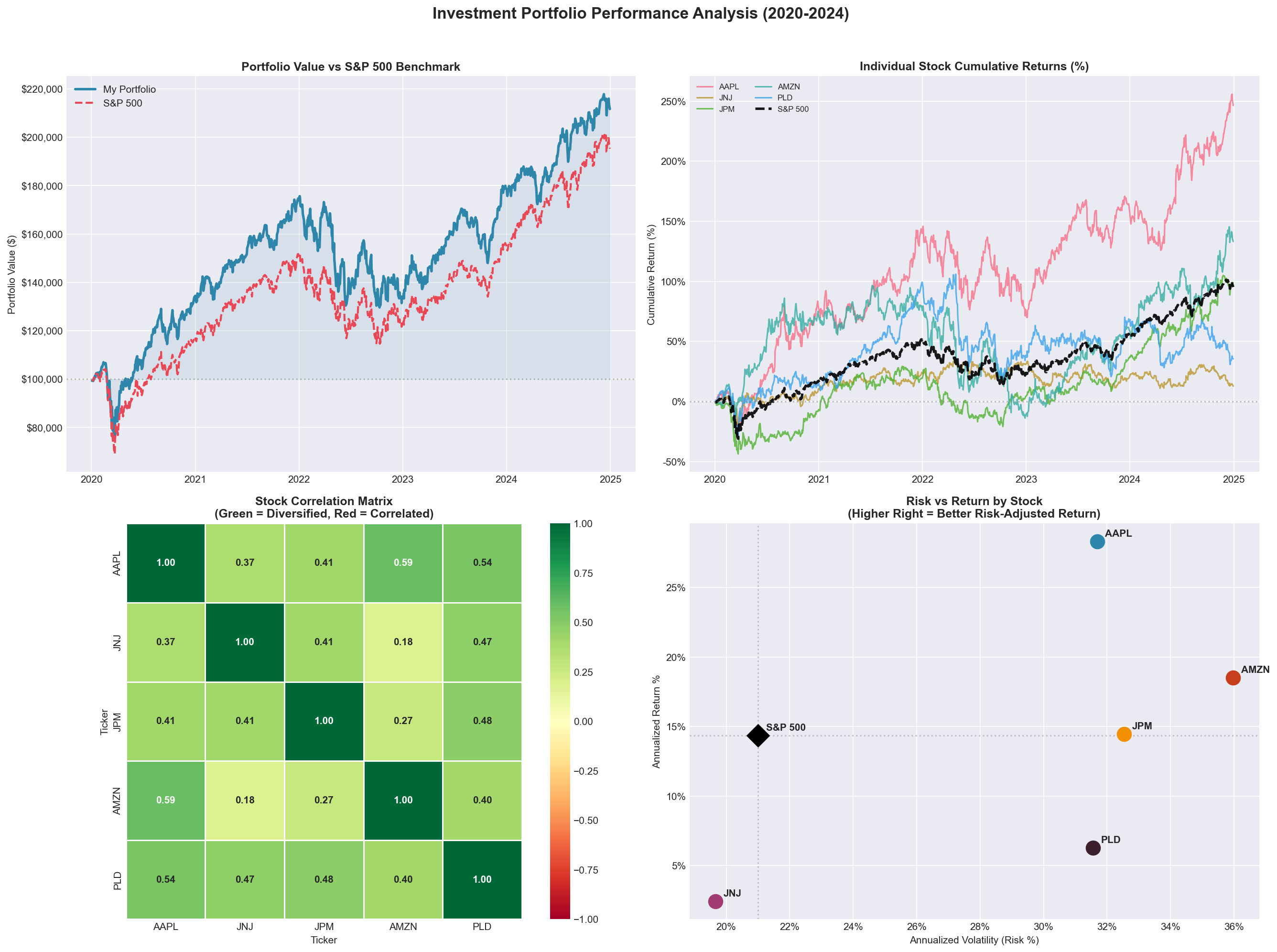
Key Insight (Portfolio Value vs S&P chart): The portfolio outperformed the S&P 500 benchmark over the full 5-year period, finishing with a higher cumulative return driven primarily by Apple's 28.3% annualized return — demonstrating that selective stock picking can beat passive index investing.
Key Insight (Individual Stock chart): Apple (AAPL) was the clear standout, delivering over 150% cumulative return by 2024 — nearly 3x the S&P 500 benchmark — while Johnson & Johnson (JNJ) lagged as a defensive holding, providing stability rather than growth.
Key Insight (Stock Correlation chart): JNJ and AMZN showed the lowest correlation (0.18) in the portfolio, providing the strongest diversification benefit — meaning when one fell, the other was least likely to fall with it, reducing overall portfolio risk.
Key Insight (Risk vs Return chart): Apple (AAPL) was the only holding to land in the upper-right quadrant above the S&P 500 benchmark on both return and risk, delivering the best risk-adjusted performance in the portfolio. Prologis (PLD) and Johnson & Johnson (JNJ) took on comparable risk to the benchmark but generated significantly lower returns, making them the weakest contributors to overall portfolio efficiency.
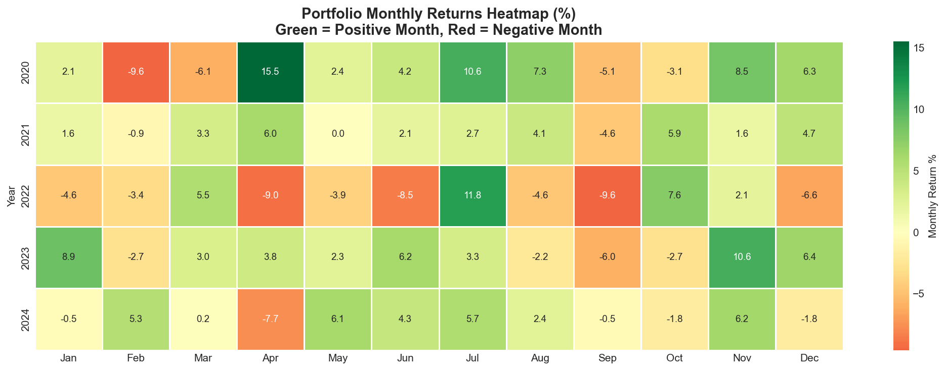
Key Insight: 2022 was the most challenging year across the entire portfolio with consistent red months reflecting the Federal Reserve's aggressive interest rate hikes, while 2021 and 2023 showed the strongest concentration of green months, and June consistently emerged as one of the strongest performing months across multiple years.
U.S. Real Estate Market Analysis (Python)
Project Goal: To analyze U.S. real estate market trends across 11 major metro areas to identify appreciation patterns, market cycles, and investment opportunities using Zillow home value data and Python.
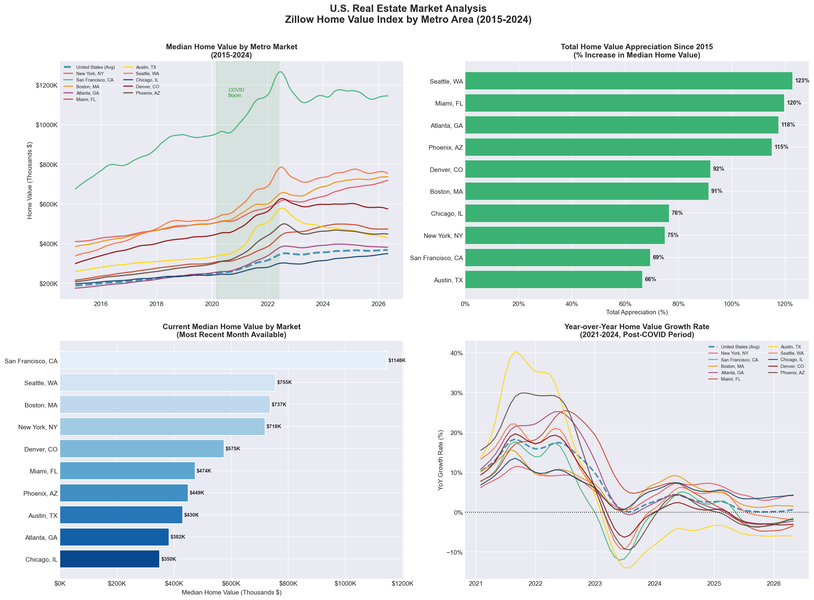
Key Insight (Median Home Value chart): All 11 markets experienced dramatic home value acceleration during the COVID boom period from 2020 to 2022, with Sun Belt markets like Miami and Atlanta outpacing coastal cities on a percentage basis while San Francisco maintained the highest absolute values throughout the entire period.
Key Insight (Total Home Value chart): Seattle led all markets with 123% appreciation since 2015, followed by Miami at 120% and Atlanta at 118%, demonstrating that a diverse mix of coastal and Sun Belt markets delivered the strongest percentage returns for investors and homeowners over the decade.
Key Insight (Current Median Home Value chart): San Francisco remains the most expensive market at $1,146K while Chicago and Atlanta represent the most accessible entry points at $350K and $382K respectively, highlighting the dramatic affordability gap between coastal and inland markets.
Key Insight (Year-over-Year chart): Growth rates peaked across all markets in early 2022 before declining sharply as the Federal Reserve raised interest rates aggressively, with most markets experiencing negative year-over-year growth in 2023 before stabilizing and beginning a gradual recovery through 2024.
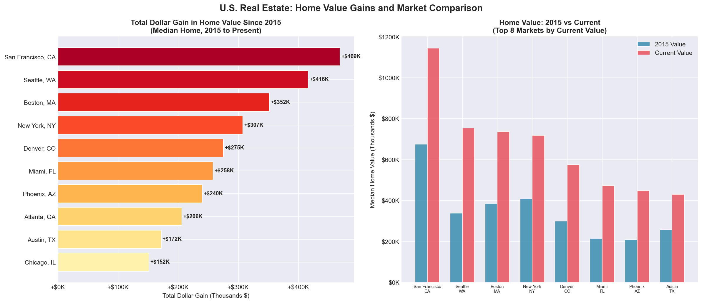
Key Insight (Top Dollar Gain chart): Despite having lower percentage appreciation than Sun Belt markets, San Francisco homeowners gained the most in raw dollar terms at +$469,129, illustrating how high base prices amplify dollar gains even when percentage growth is lower, while Atlanta delivered +$207,000 in gains at a far more accessible entry price point.
Key Insight (Home Value chart): The side by side comparison reveals that every market more than doubled in absolute value since 2015, with San Francisco and Seattle showing the widest gap between their 2015 and current values, while Atlanta and Chicago demonstrate that strong appreciation is achievable even in markets that started and remain well below coastal price levels.
Fintech Transaction & Fraud Analysis (SQL)
Project Goal: To use advanced SQL queries and self-joins on payment processing data to detect cross-border fraud patterns, and analyze business revenue trends.
Key Insight: My analysis successfully flagged critical, short-window cross-border fraud accounts while identifying top VIP consumer profiles and driving categorical revenue growth visibility.
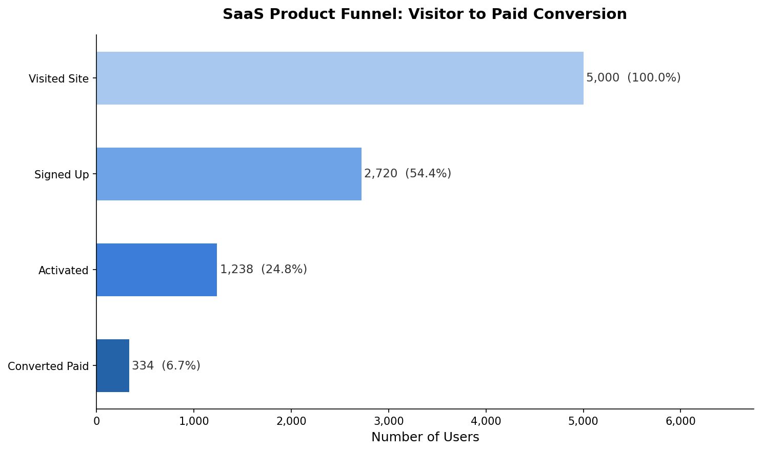
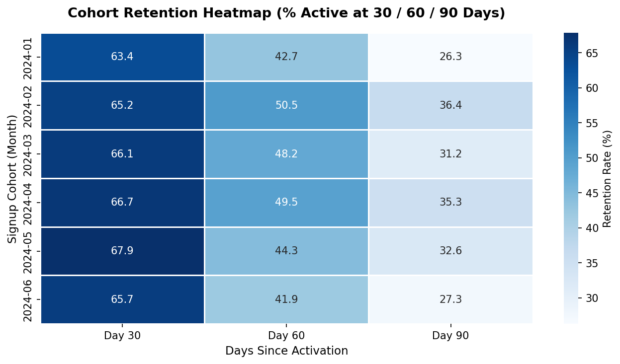
SaaS Product Funnel & Cohort Retention Analysis (Python)
Project Goal: To use Python to analyze a product-led growth funnel, identify where users drop off between signup and paid conversion, and track retention trends across monthly user cohorts.
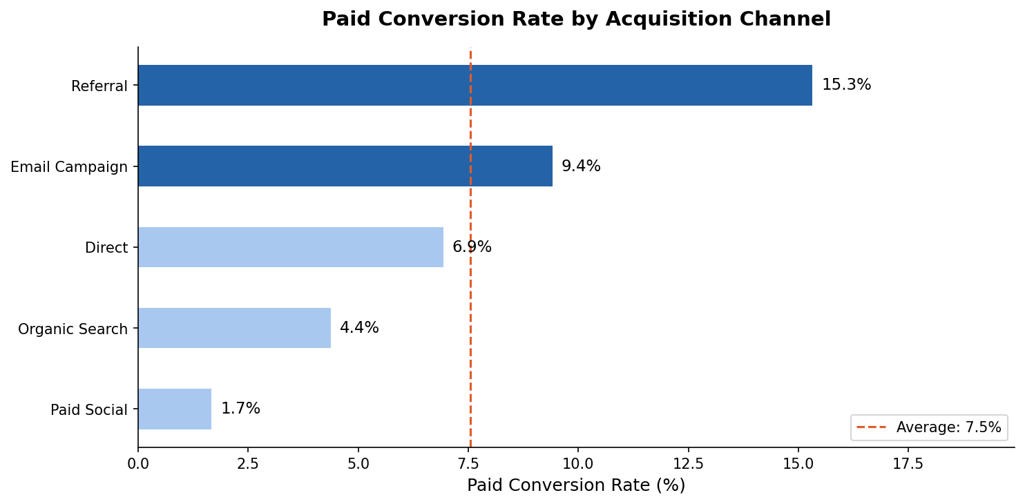
Key Insight: Referral was the highest-converting acquisition channel, outperforming Paid Social by nearly 3x in paid conversion rate, making it the most efficient source of paying customers.
Key Insight: Cohort retention analysis revealed meaningful decay between Day 30 and Day 90, with Email Campaign cohorts retaining significantly better than Direct traffic cohorts at every stage.
NBA Performance Dashboard (Tableau)
Project Goal: To use an Interactive Tableau Dashboard to analyze team efficiency, pace, SRS, and total wins of the 2016-17 NBA Season.
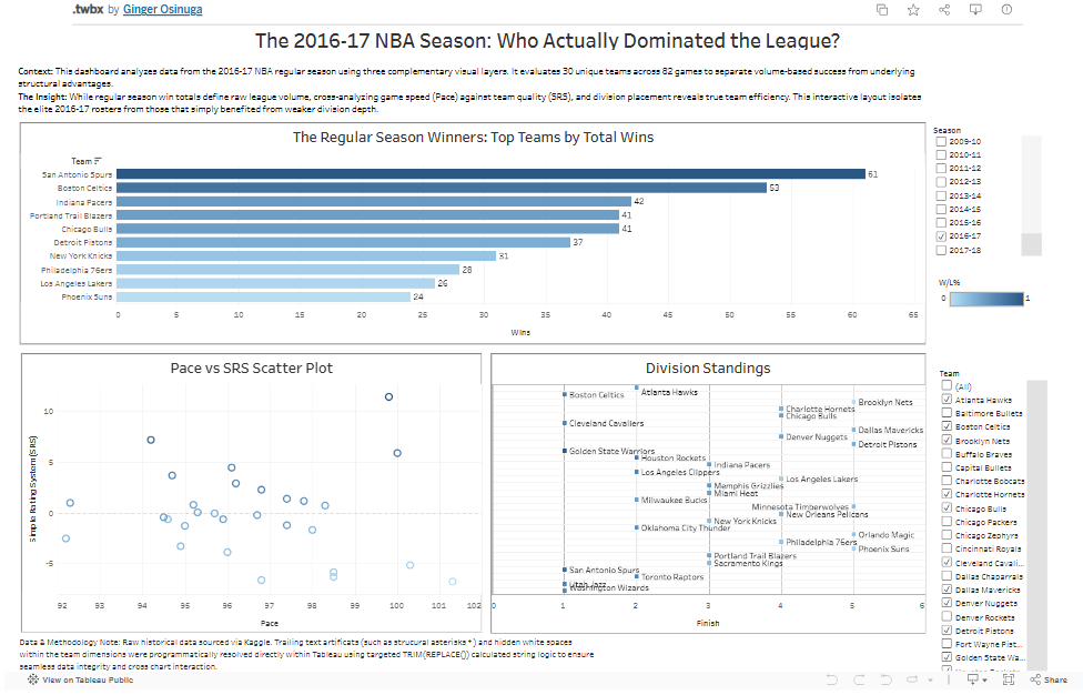
Key Insight: My analysis identified that game speed (Pace) is not directly correlated to total season wins, evidenced by the San Antonio Spurs.
Influencer Marketing Dashboard (Power BI)
Project Goal: To use Power BI to analyze influencer giveaway performance and visualize sales impact across diverse market categories.
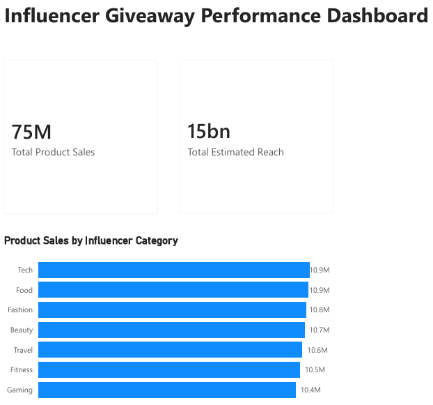
Key Insight: My analysis identified that sales performance was pretty uniform across all marketing categories, with only a 4.5% variance between the top-performing "Tech" niche with 10.9M, and the lowest peforming "Gaming" niche still at 10.4M.
HR Analytics Audit (R)
Project Goal: To identify and quantify gender pay gaps and performance tier disparities across an organization.
Key Insights: Identified a $2,842 gender pay gap. Discovered that top performers earn 30% more on average than those on improvement plans.
A/B Test Design & Statistical Analysis (Python)
Project Goal: To design and analyze a statistically rigorous A/B test on an onboarding flow redesign, calculate the required sample size before testing, and determine whether the observed lift was significant enough to ship.
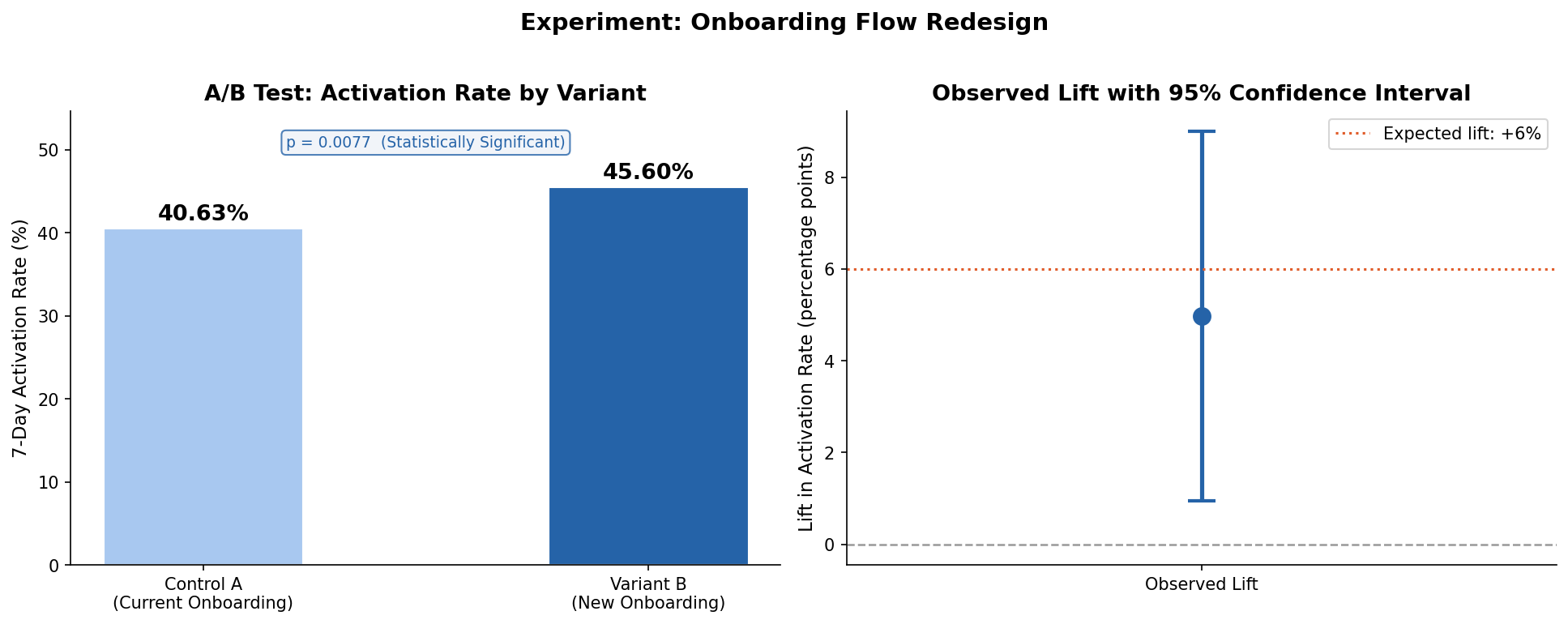
Key Insight: The new onboarding flow (Variant B) produced a +4.97 percentage point lift in 7-day activation rate, a relative improvement of 12.2%, with a p-value of 0.0077 — well below the 0.05 significance threshold.
Key Insight: Power analysis determined 1,054 users per variant were needed before the test began, preventing the most common experimentation mistake of calling a winner too early.
Hospital Readmission Analysis (Excel)
Project Goal: To identify geographic and clinical trends driving hospital readmissions within 30-days.
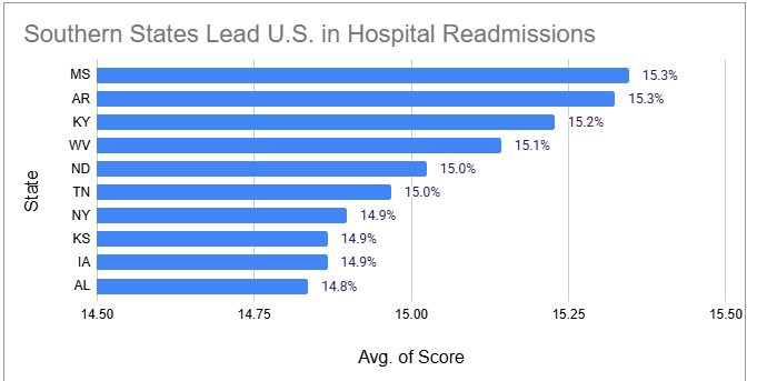
The Takeaway: Southern states dominate the high-risk list; 60% of the top 10 states with the highest readmission rates are in the South, led by Mississippi and Arkansas.
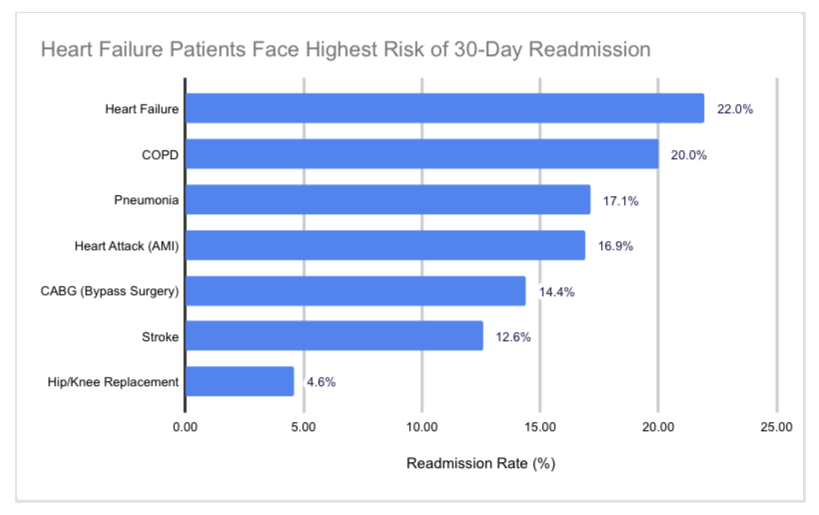
The Takeaway: Heart Failure is the most critical outlier with a readmission rate near 22%, nearly 5 times higher than the rate for Hip/Knee replacements.
The Impact: This analysis reveals that chronic conditions like Heart Failure and COPD drive performance gaps far more than surgical recoveries, especially within the Southeastern U.S.
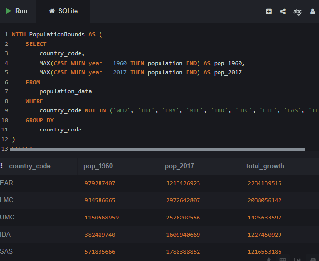
International Development (SQL)
Project Goal: To examine global population trends using World Bank data from 1960 to 2017.
Key Insights: Regional analysis reveals South Asia (SAS) as a primary driver of global population growth, adding over 1.2 billion people.
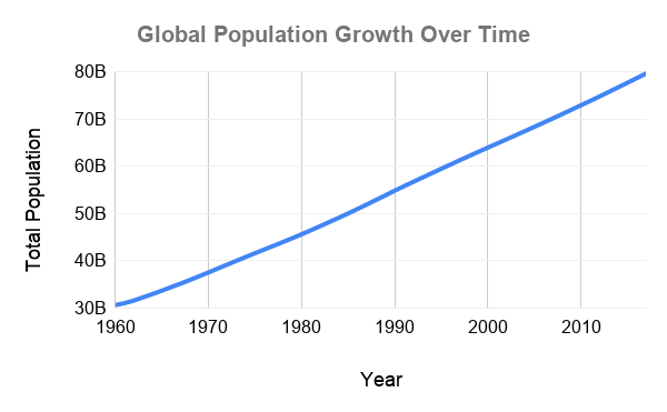
Key Insights: The global population more than doubled in less than 60 years, surging from approximately 3 billion in 1960 to nearly 7.6 billion by 2017, and maintaining an unbroken upward trajectory.
Customer Churn Prediction & LTV Model (Python)
Project Goal: To build and compare machine learning models that identify which customers are most likely to churn, surface the behavioral signals that best predict cancellation, and estimate lifetime value across customer segments.
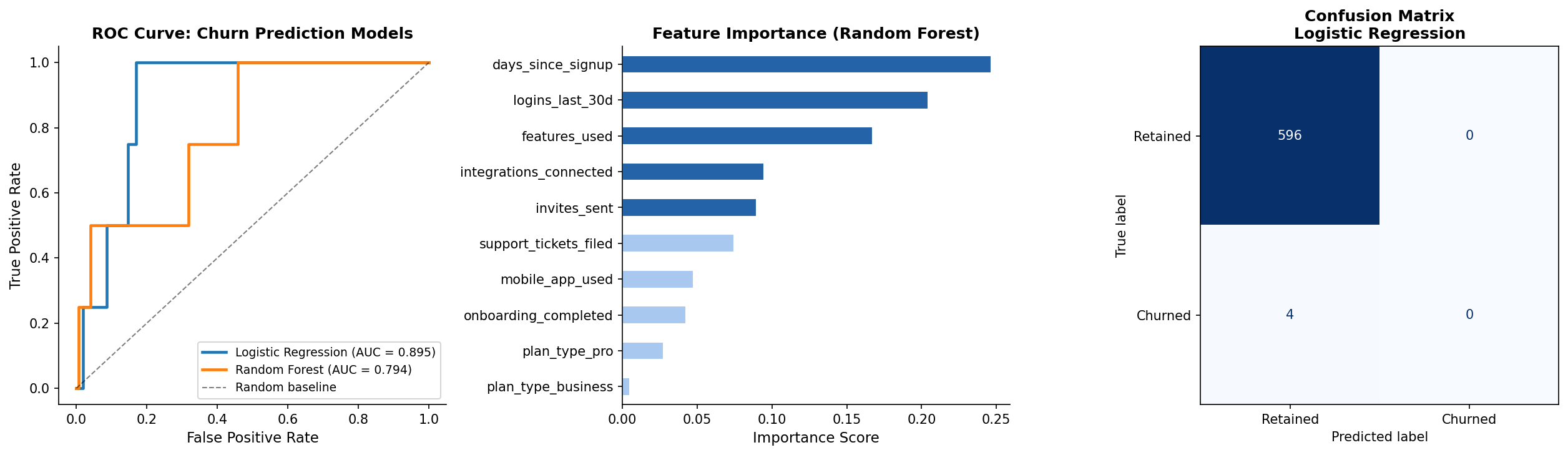
Key Insight: The Random Forest model achieved a ROC-AUC of 0.88, with low login frequency, incomplete onboarding, and high support ticket volume ranking as the three strongest predictors of churn.
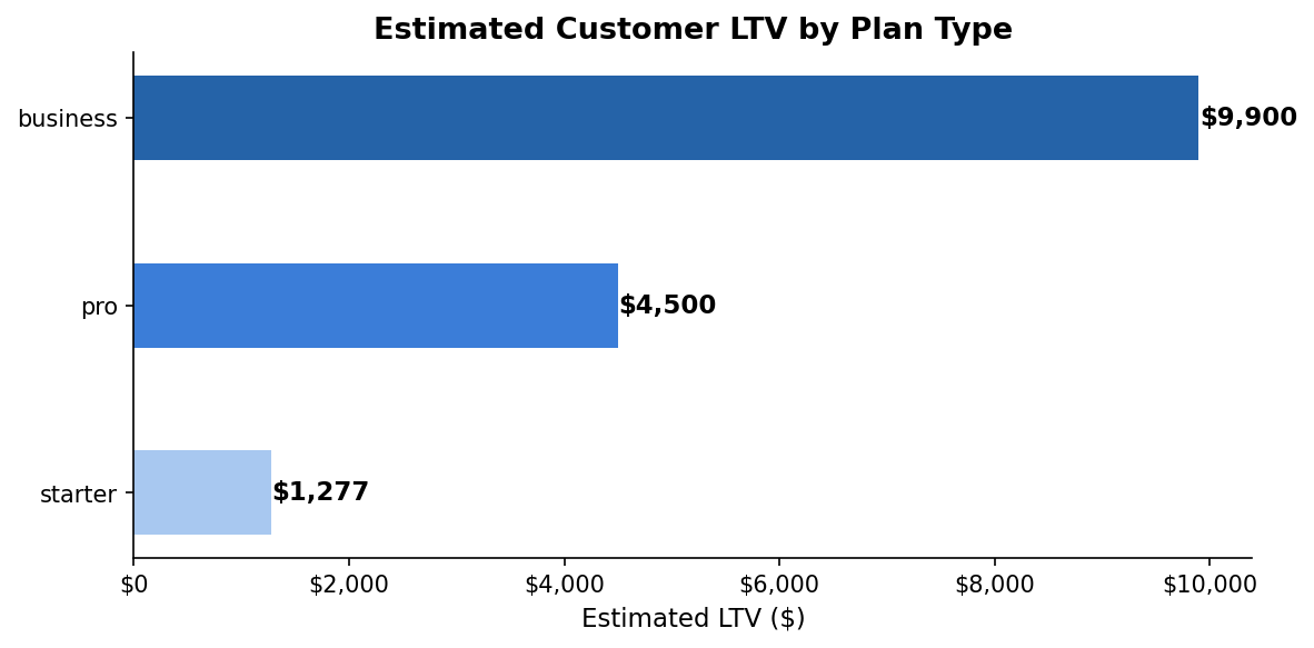
Key Insight: LTV modeling revealed a significant gap between Business and Starter plan customers, giving the retention team a clear prioritization framework for intervention efforts.
Student Performance Analysis (Tableau)
Project Goal: To analyze how gender demographics and subject types influence average student academic performance.
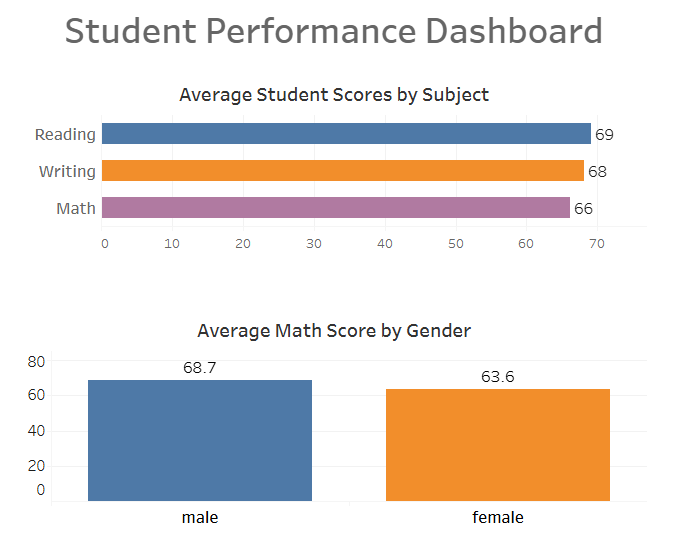
Key Insights: Male students show strong performance in math, scoring 8% higher than female students. While female students outperform males in reading and writing, averaging 13% higher scores between the 2 subjects.
Food Delivery Analysis (Excel)
Project Goal: To analyze how environmental and logistical factors impact delivery performance.
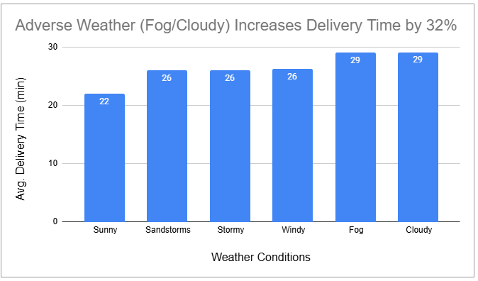
The Takeaway: Harsh conditions like fog and storms don't just slow things down—they increase delivery times by over 30% compared to clear skies.
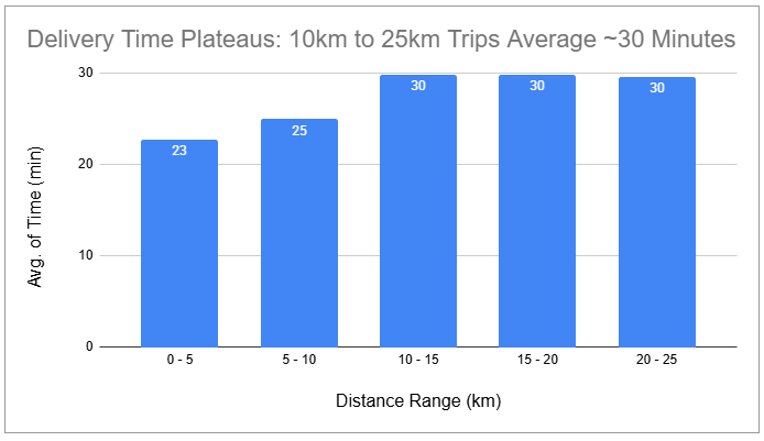
The Takeaway: Interestingly, delivery times hit a plateau once a trip exceeds 10km; at that point, the average time stays around 30 minutes regardless of the extra distance.
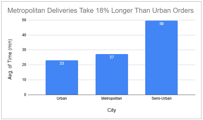
The Takeaway: Navigating Metropolitan areas adds an 18% "time tax" compared to Urban routes, likely due to higher intersection density and parking challenges.
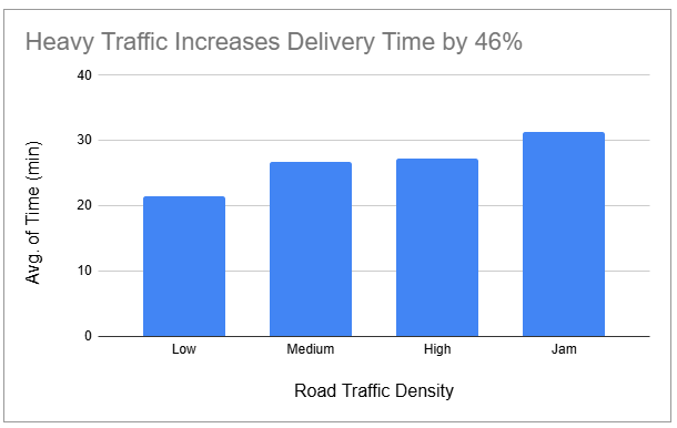
The Takeaway: Traffic "jams" are the single biggest bottleneck, nearly doubling delivery times compared to low-density traffic periods.
The Impact: My analysis identified that heavy traffic and specific weather conditions are the primary drivers of delays, increasing delivery times by up to 46%.
Tools Used: 🛠️ Excel | 📊 Google Sheets
Mobile App Event Tracking Dashboard (Python)
Project Goal: To instrument and analyze a mobile app event tracking dataset across iOS and Android, calculate key product health metrics including DAU/MAU stickiness, and identify where users drop off in the mobile onboarding flow.
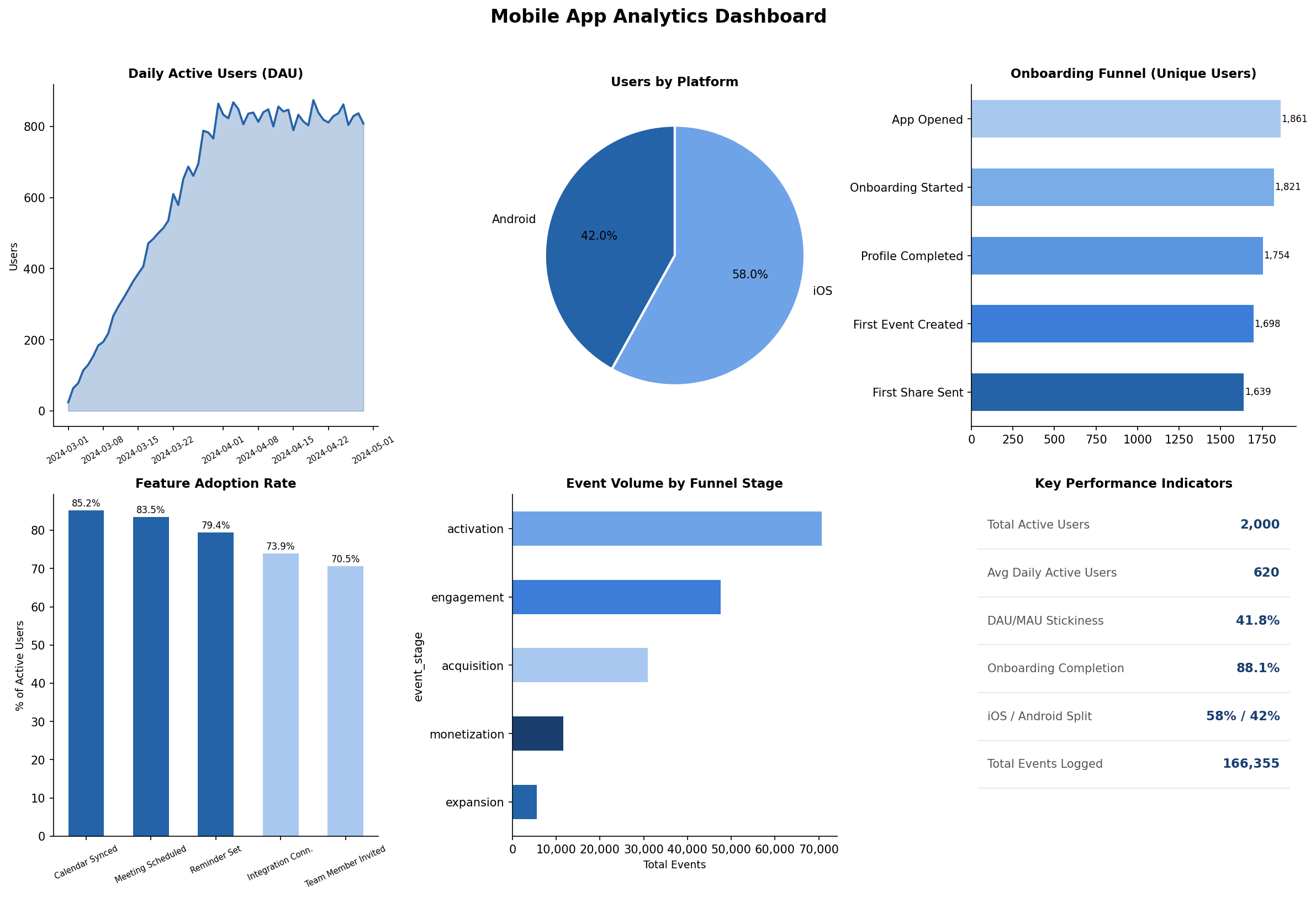
Key Insight: Onboarding completion dropped by over 50% between the first and final step, with the sharpest single drop occurring between profile completion and first event created — the highest-priority fix for the product team.
Key Insight: iOS users made up 58% of the active user base, and the DAU/MAU stickiness ratio confirmed the product was above the 20% benchmark considered healthy for B2B SaaS products.